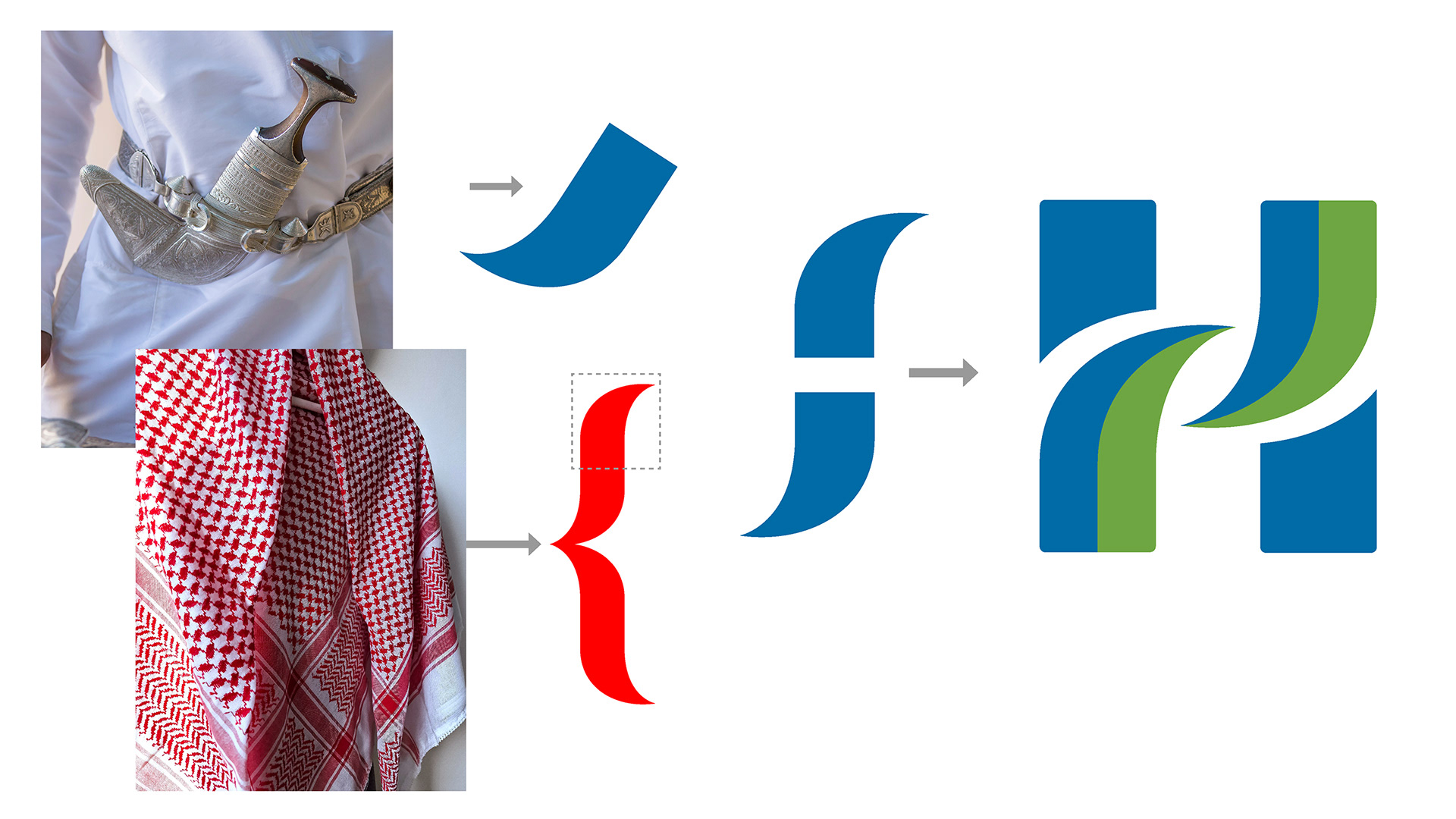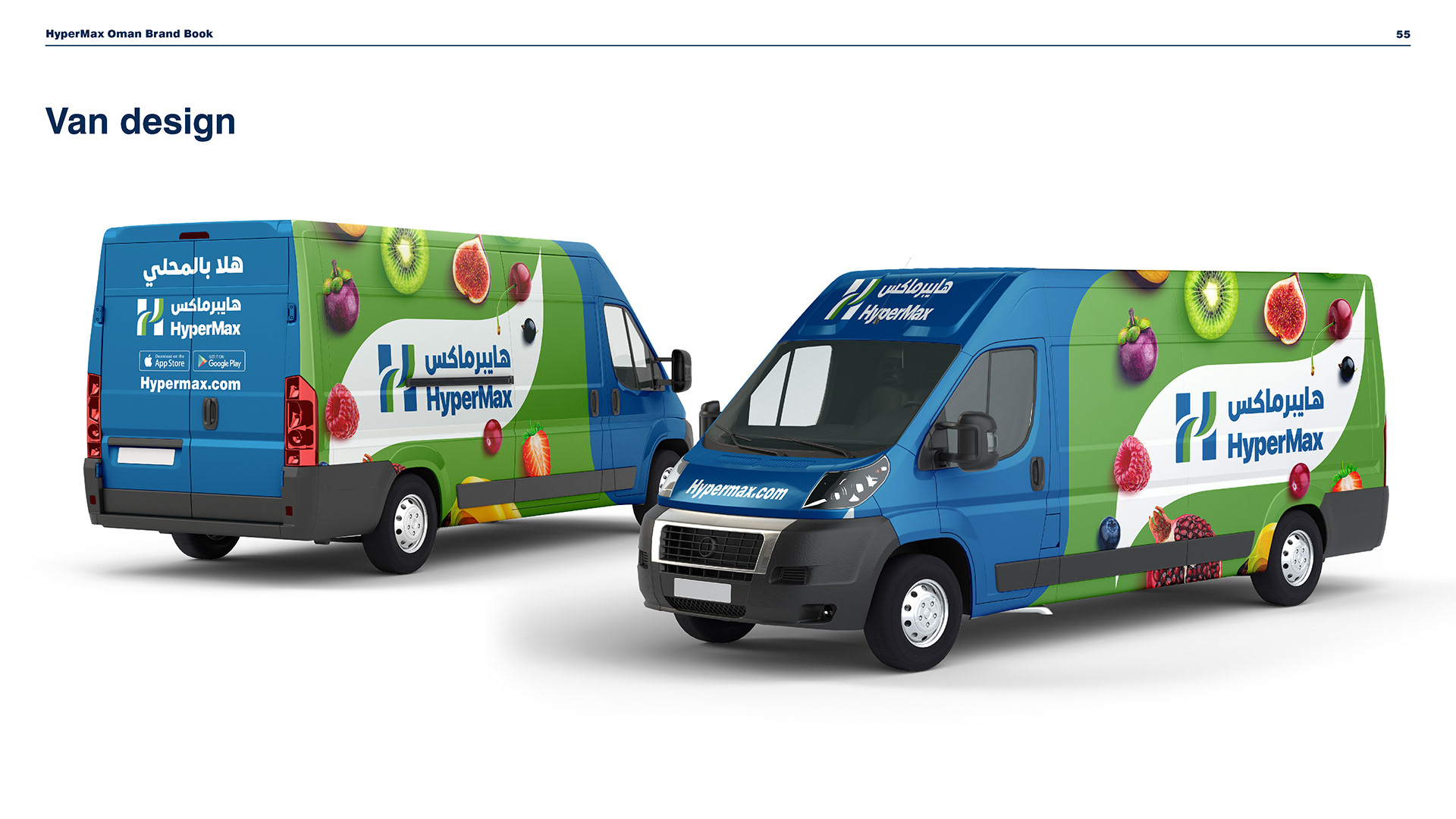
HyperMax visual identity
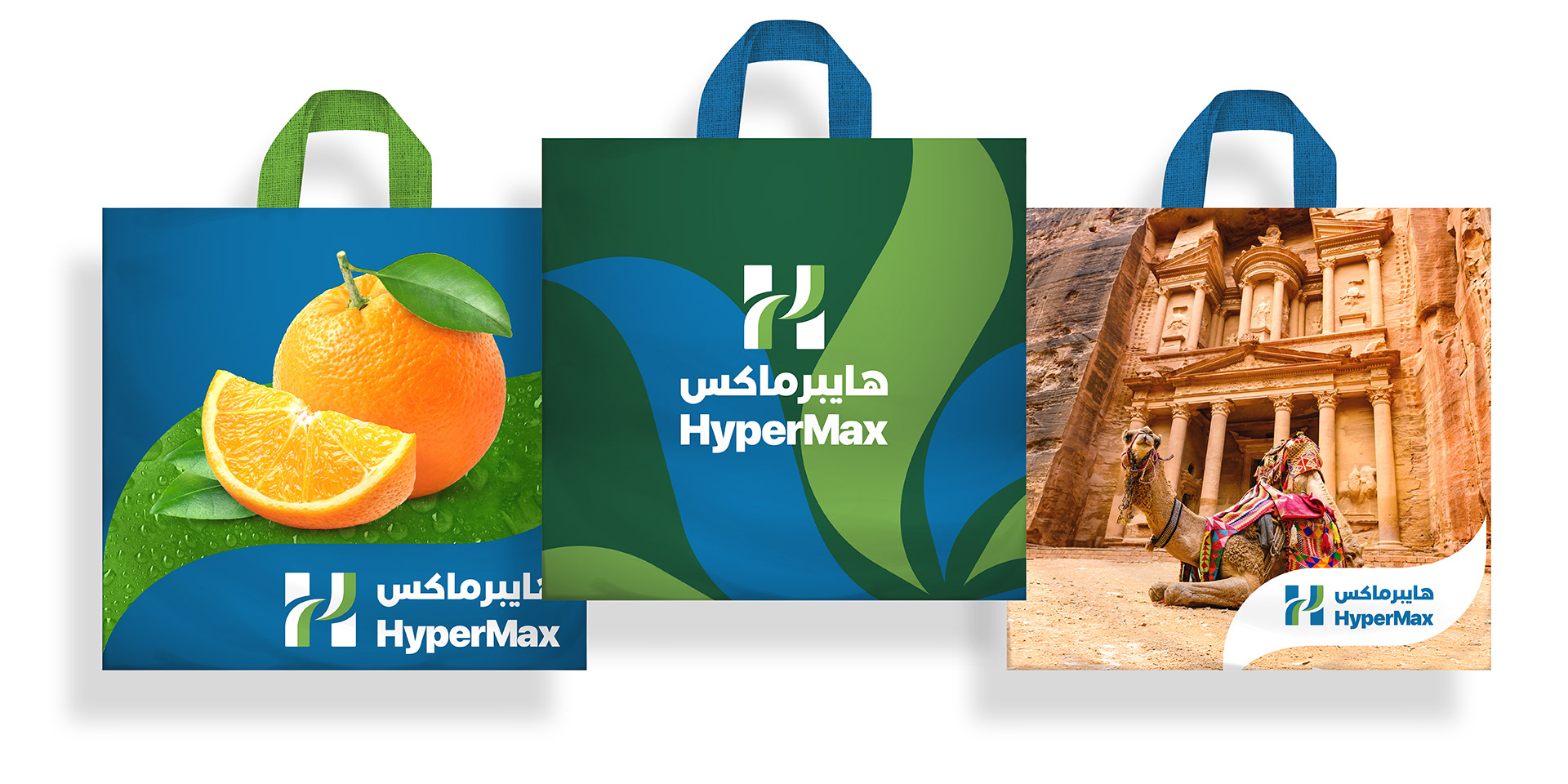
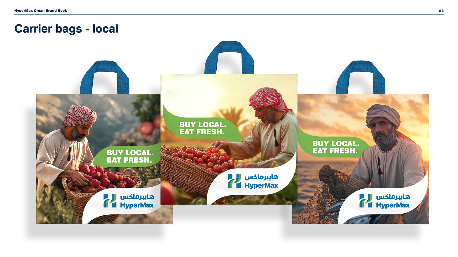
A full visual identity created from scratch for a new hypermarket brand in Jordan, Oman, Bahrain, and Kuwait, using iconic regional cues to highlight how HyperMax sits at the heart of local communities.
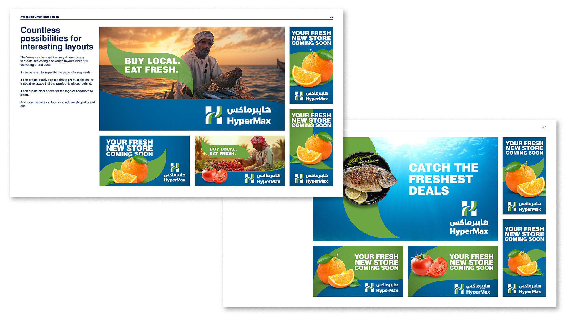
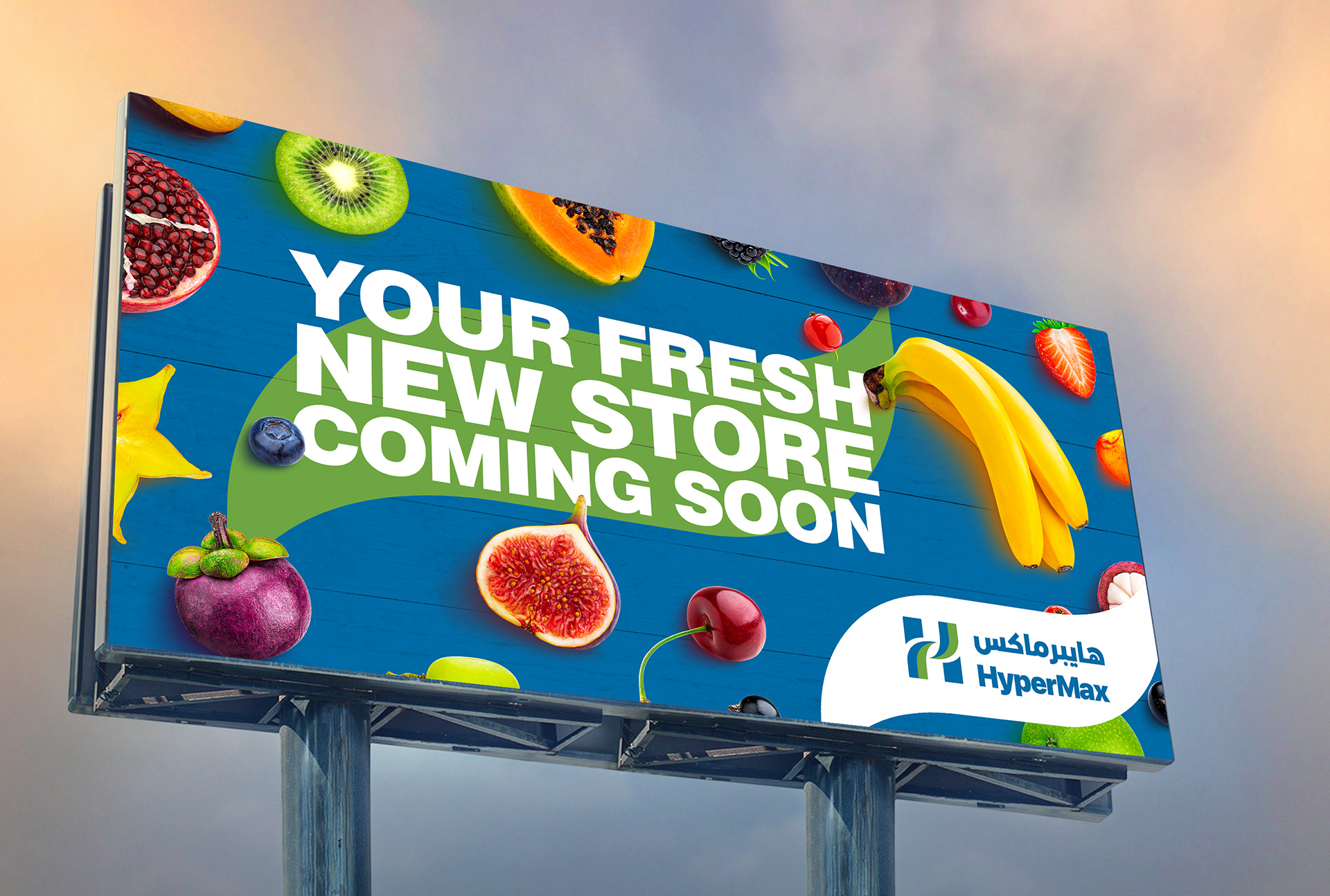
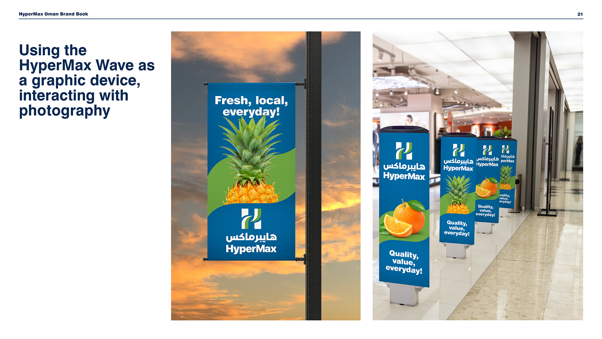
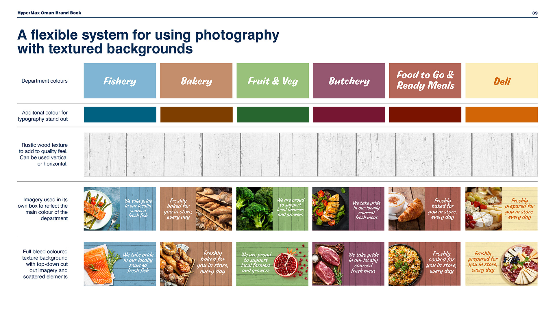
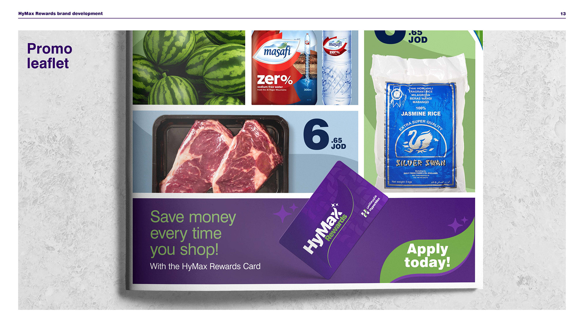
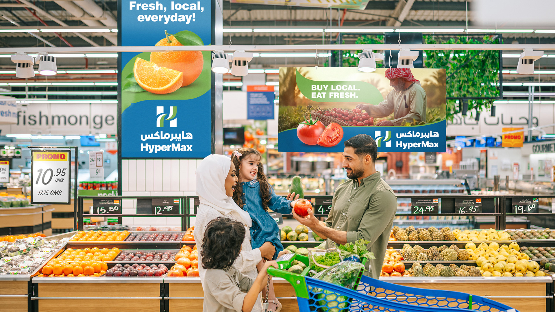
Creative strategy and concepts, typography, colour palettes, patterns, art direction, photography styles, digital channels and iconography, crafted to work with consistency and unmistakeable distinctiveness online and offline. All formalised with clear and flexible guidelines in a brand book to work across all departments of the business, in physical stores, out in the world, and across social media, apps, and e-commerce.
Our role: Creative direction, design crafting, tone of voice, UI and digital illustration, and formalising everything in repeatable yet flexible systems. We also trained local teams on how to use the brand's design toolkit.
From 0 to 60+ stores across four markets
HyperMax rolled out from Jordan and Oman into Bahrain and Kuwait in under a year. A complete transformation of MAF’s entire Carrefour estate in those markets using our brand book and identity system.
HyperMax rolled out from Jordan and Oman into Bahrain and Kuwait in under a year. A complete transformation of MAF’s entire Carrefour estate in those markets using our brand book and identity system.
Strengthening communities through local suppliers and jobs
HyperMax now partners with hundreds of local farmers, producers and SMEs and has created thousands of new retail jobs, bringing its “for the community, by the community” positioning to life.
HyperMax now partners with hundreds of local farmers, producers and SMEs and has created thousands of new retail jobs, bringing its “for the community, by the community” positioning to life.
MAF’s flagship grocery brand for the region
Majid Al Futtaim now refers to HyperMax as its independently owned flagship grocery brand in Jordan, Oman, Bahrain and Kuwait; a long-term platform for growth, not a short-term rebrand.
Majid Al Futtaim now refers to HyperMax as its independently owned flagship grocery brand in Jordan, Oman, Bahrain and Kuwait; a long-term platform for growth, not a short-term rebrand.